Skintype Quiz: Designing for Logic and Usability

Designing for Logic and Usability
Problem
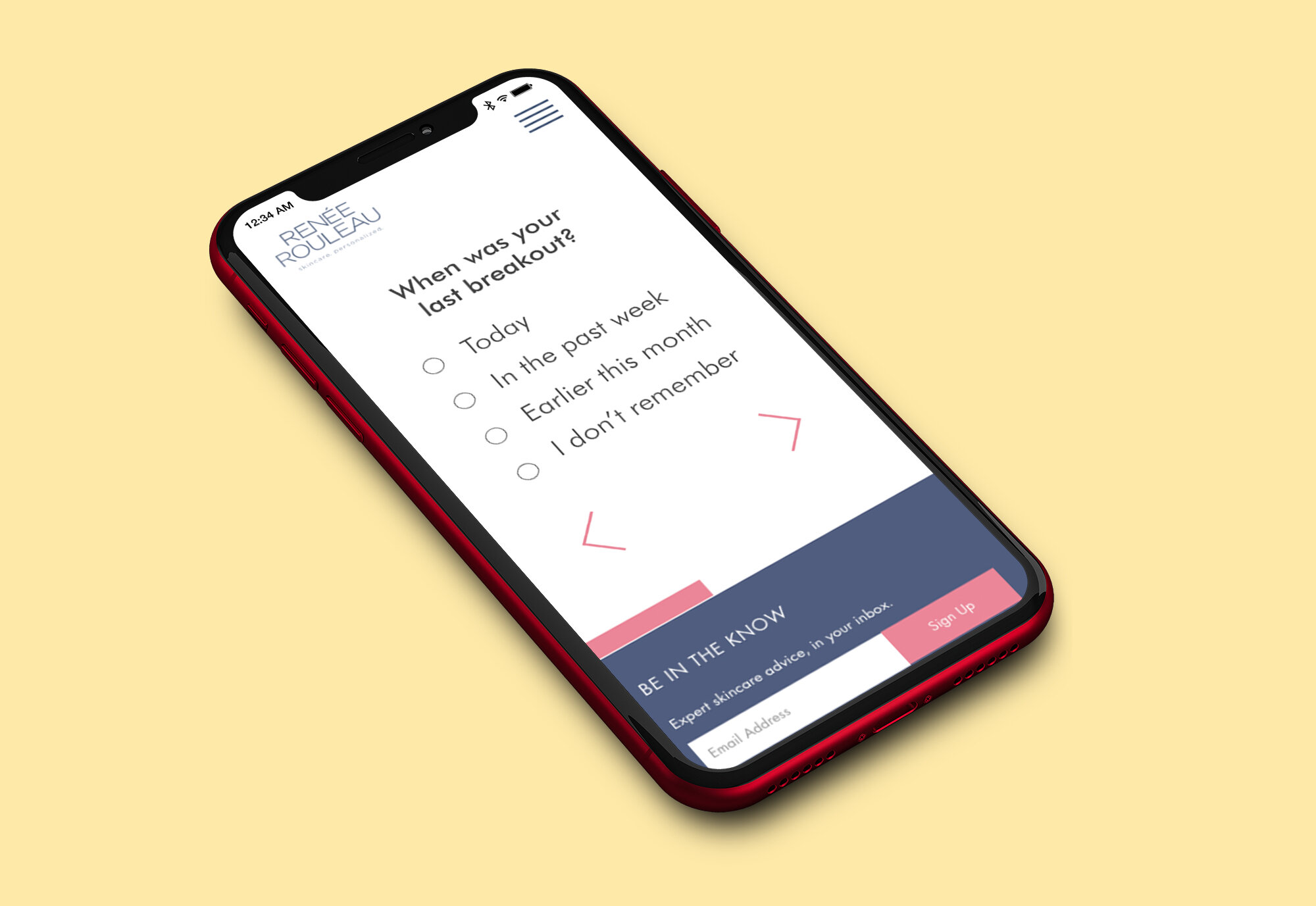
I was seeking to solve a few interesting problems. My company had a live skincare quiz already but the logic behind the quiz made it wildly inaccurate. One of the nine skin types was not even an option in the results and most users were funneled to one of the two other skin types regardless of their answers to questions. The original quiz also had usability issues, especially on mobile. The original mobile version of the skin typing quiz had many questions running off the page, small font sizes, huge margins, and hard to find progression buttons. All of this was turning user and potential customers away from the website and ultimately the brand.

Original mobile site

Mobile redesign
Beginning with the logic in mind
I began designing a new skin typing quiz by focusing on the information architecture needed to receive accurate results. I based my original design on the interview structure that our esthetician used in in-person skin consultations. The marketing team presented me with their data that the average person coming to the quiz was new to the site and the brand but who was also interested in learning more about their skin. I defined the user I would design for as a novice who was interested in skincare and I made the goal to be getting accurate results for this person no matter their skin conditions.
Content Design
I began by creating a scoring logic using questions that could be easily self-reported by my user. My first iteration was a long quiz with detailed questions. I tested this version of the quiz with users and found that it was accurate, and thus solved the original problem, however, it was long and the tone of the questions was rather technical


Estheticians’ in-person questionnaire

Overly technical questions
I iterated on this design. Based on user preferences expressed during the research phase and under the advice of our marketing consultant I combined and shortened questions, aiming to boil the information down to a ten question quiz. I also worked with the marketing team to adjust the wording of the questions to sound friendlier. This version of the quiz was much less accurate. I tested this short friendly version and it failed to give users correct results. I adjusted the wording to be more specific and tested again; it was still inaccurate. Each time I iterated on this shortened quiz the results were unreliable, only giving accurate results to a few types of users at a time. Each version served one or another skin type but this approach was not yielding precise results for people with all skin conditions.
Collaboration with marketing
I collaborated with the marketing team to ideate a new solution for the architecture problems I was encountering. The results of this was a move towards weighted scoring on the questions I had combined to shorten the quiz. I created a new version of the ten question friendly sounding quiz which included varied weights to the answers. I tested it with users and it failed. But, when I adjusted the weighting and tested it again it passed with flying colors! We now had a quiz that worked for people of all skin types that was short enough for users to complete.
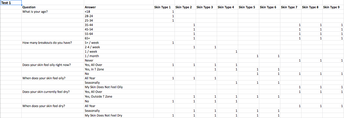
Seldomly accurate logic

Accurate weighted scoring
Once the logic of the quiz was testing accurately and providing a good user experience, as measured by user testing, I began to work on the user interface design. I started with the results page as it affected how the developers would code in the logic of the quiz.
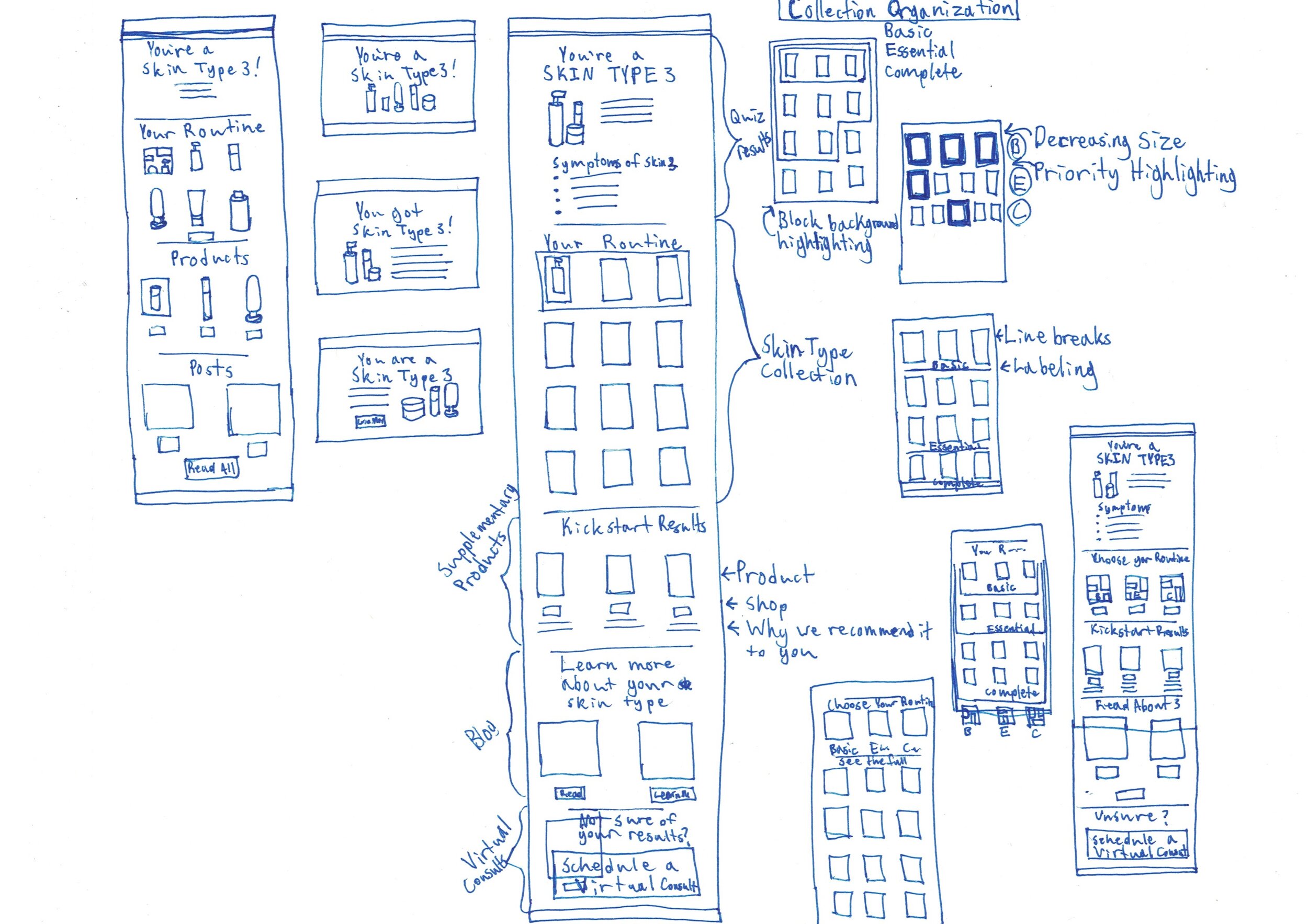
For the results page of the new quiz I worked with the marketing consultant to determine what results users expected to see and where the marketing team could recommend products to the customer. The original results page showed users a generic info sheet of skin concerns, some of which may not apply to the user based on their answers to quiz questions. My redesign made it clear which skin type they were and then offered customized product recommendations that would be based on the user's answers to specific questions. The questions that would point toward product recommendations where marked within the information architecture I created so that the developer working on the quiz would know what questions and answers to point to which products.
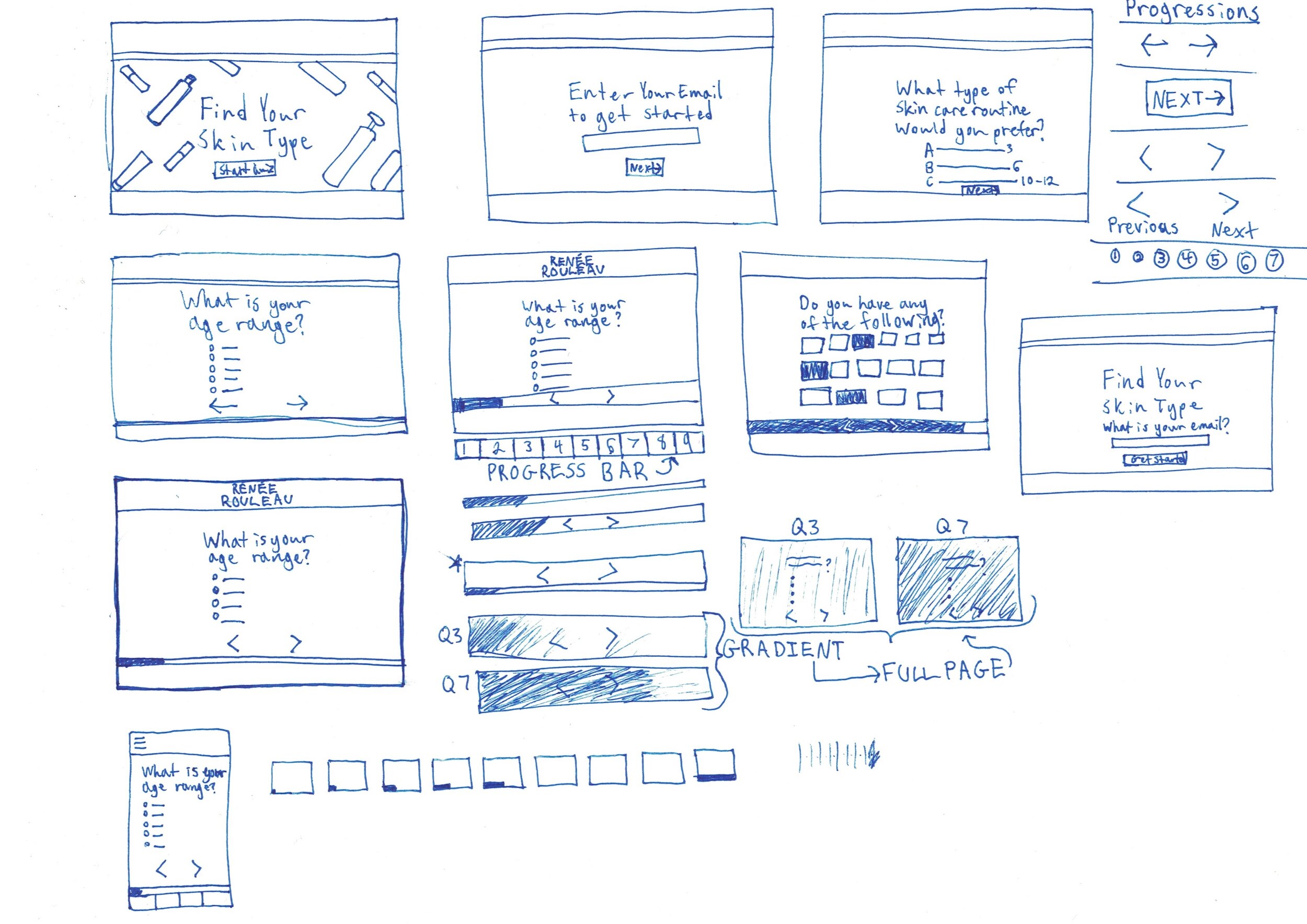
Wireframes
For the results page and all the other pages in the quiz I began by creating low-fidelity wireframe sketches on paper. While creating these new layouts, I sought to tackle some of the usability issues of our current quiz. In my competitor research I had found common UI patterns in use such as clear pagination, simple start pages, and personalized results pages. While many of those changes would require development dollars I knew I could make changes to the CSS to make progressing through the quiz easier.



Mockups
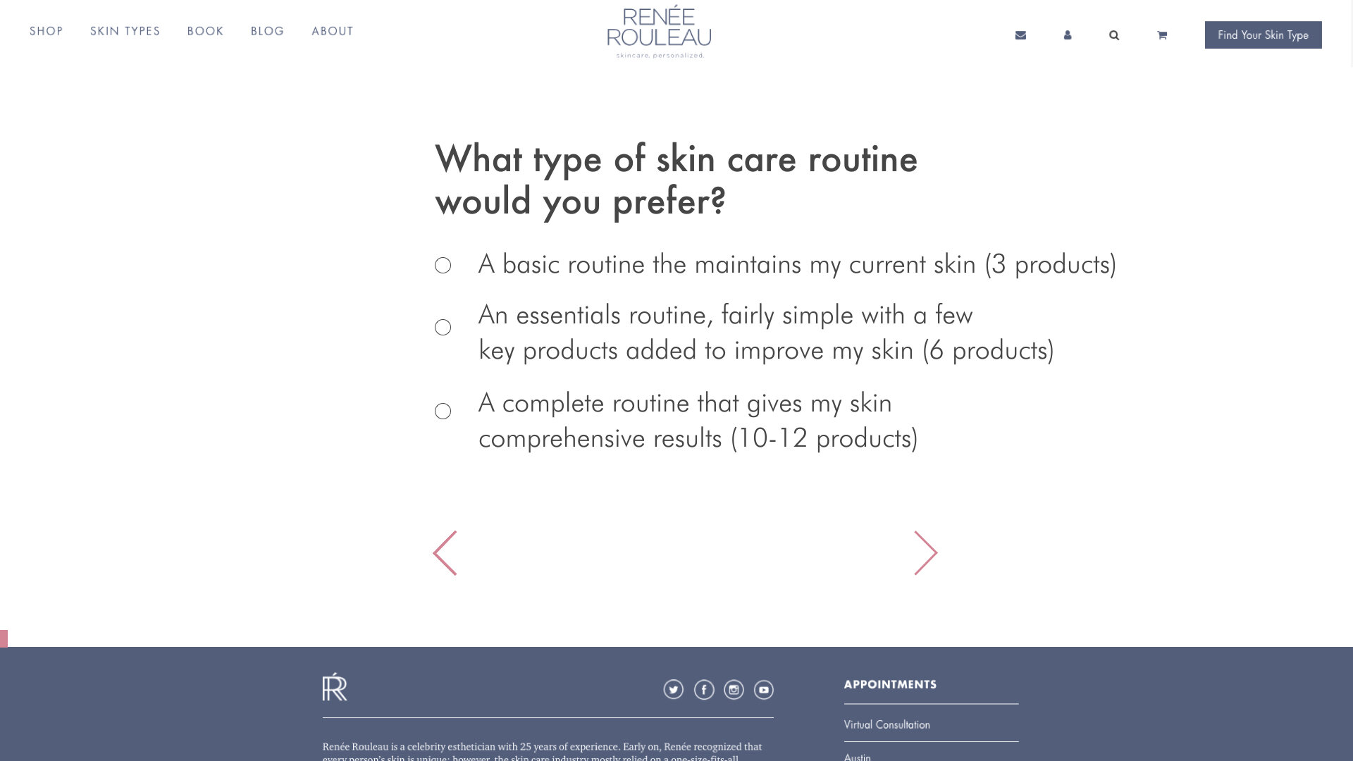
I then created high-fidelity mockups of each page in Adobe XD. The designs for the quiz start page and questions pages were based on UI patterns I found of competitor quizzes. I added a prominent start button and worked with marketing to include email capturing so that marketing could better track users path to becoming customers. I made clear pagination and controls visible without scrolling on mobile and desktop. Finally, I simplified the layout and colors of the page itself.
Outcome
I presented these high-fidelity mockups to the marketing consultant, the CEO, and a freelance developer. I also presented the spreadsheet laying out the logic of the new quiz. When I left this company the quiz was still under development.
