Content and Visual Design for Book Reviews

Content and Visual Design for Book Reviews
Readwell Reviews is the passion project of a sci-fi and fantasy enthusist. I was asked to dig into the lack of traffic the site was receiving and their poor retention rate. I began by learning more about the sites current users and potential users. The author of the site said her focus was science fiction and fantasy readers. However, the current site included reviews for books and articles from all genres that spoke to a much wider audience. The site owners did not want to edit, add, or remove any content on the site so I chose to work with both sci-fi fans and general readers in mind. In familiarizing myself with the site, I found that the original organization and navigation the site made it difficult to determine what book reviews or other content was currently on the site at all, let alone find something specific. So, to better understand the business and the content I was working with I conducted a content audit.
Site Structure
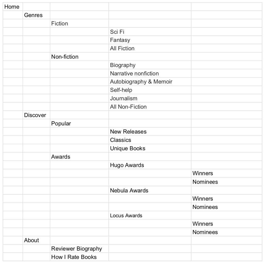
I used a content analysis tool to download an overview of all of the content on the site. I then sorted and color coded the content inventory in order to be able to visually see what the scope of the site was. I used my organized content inventory to begin creating a new and more structured information architecture for the site. I created a site structure based around genres and exploration and sketched it out in a spreadsheet.

Content inventory of the original site

Proposed site structure
Tree Testing
I needed to site my proposed site map with current and potential users to know where the assumptions I was making were valid. I hoped that the groupings I had made with the review content would make reviews easier to locate. I took my proposed site map and used a tree test to validate it with users.

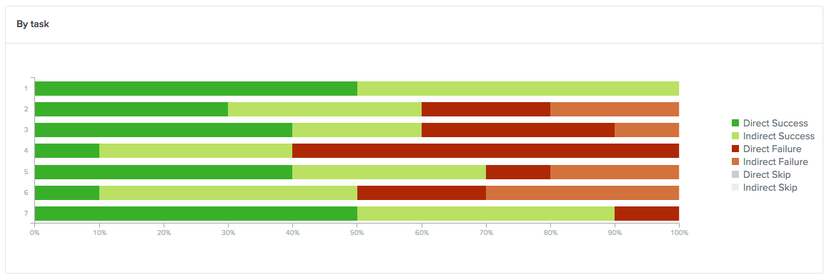
Overall user success of an individual task
Success metrics graph for all tasks
Revised site structure
I received mixed results from my test. I found that some tasks were clear to all or nearly all participants, however, I had a few widely problematic tasks. Through testing I learned that many users were unfamiliar with genre classifications. I also determined that some of my exploratory categories could be combined to help simplify the choices users would have to make. After reviewing the results of the tree test, I altered my proposed site structure.
Redesigned site structure after tree testing
UI Sketches
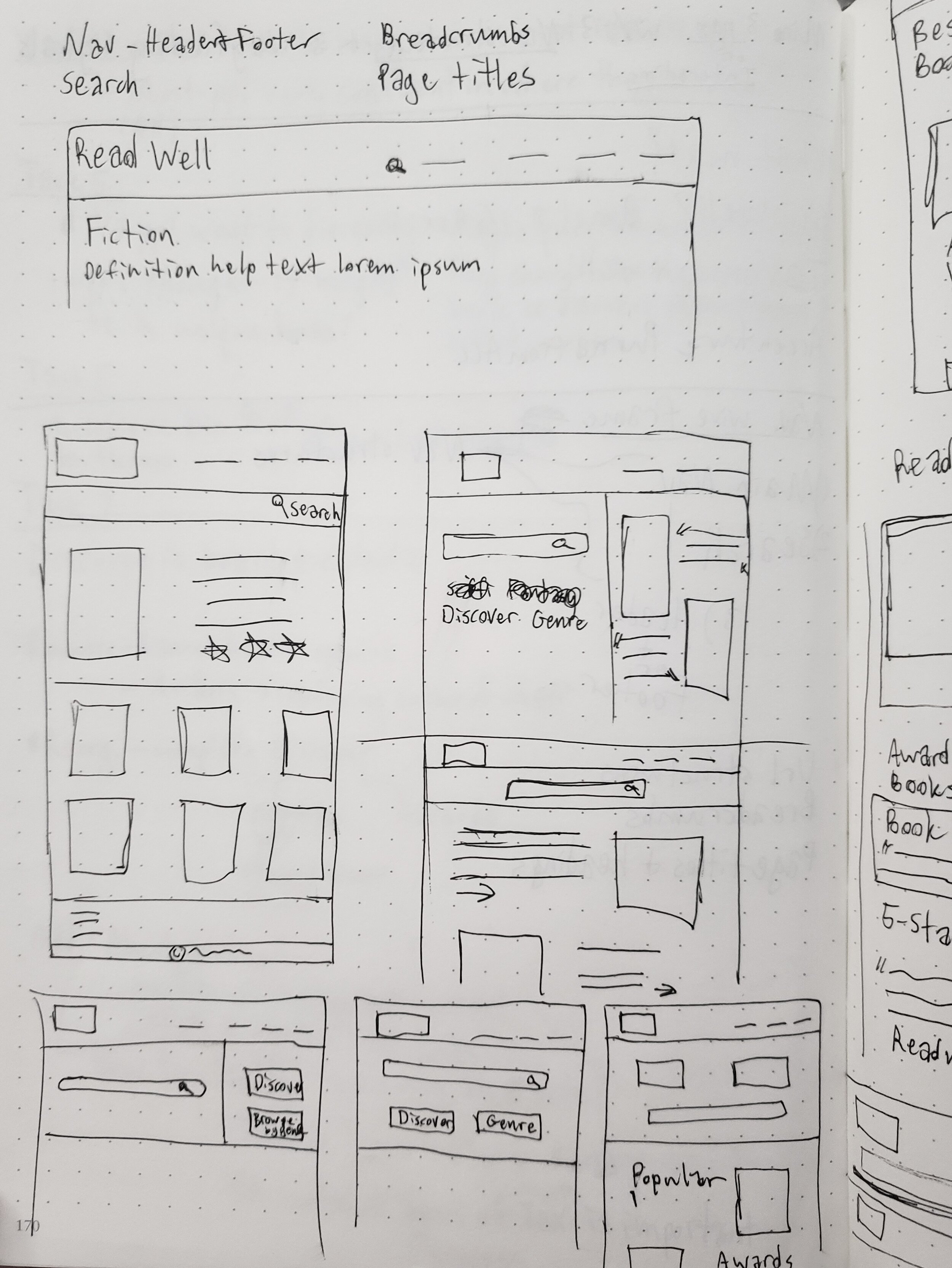
With my site structure clarified, I began designing pathways through the structure with UI features and navigation elements. I sketch many possible page layouts for various avenue throughout the site. I eventually settled on a simple main nav visible in both the header and the footer and a tabbed sub-navigation within the genres page. I also designed a “similar titles” section to show related reviews on individual review pages in the hope of keeping visitors on the site longer.
Review page sketches
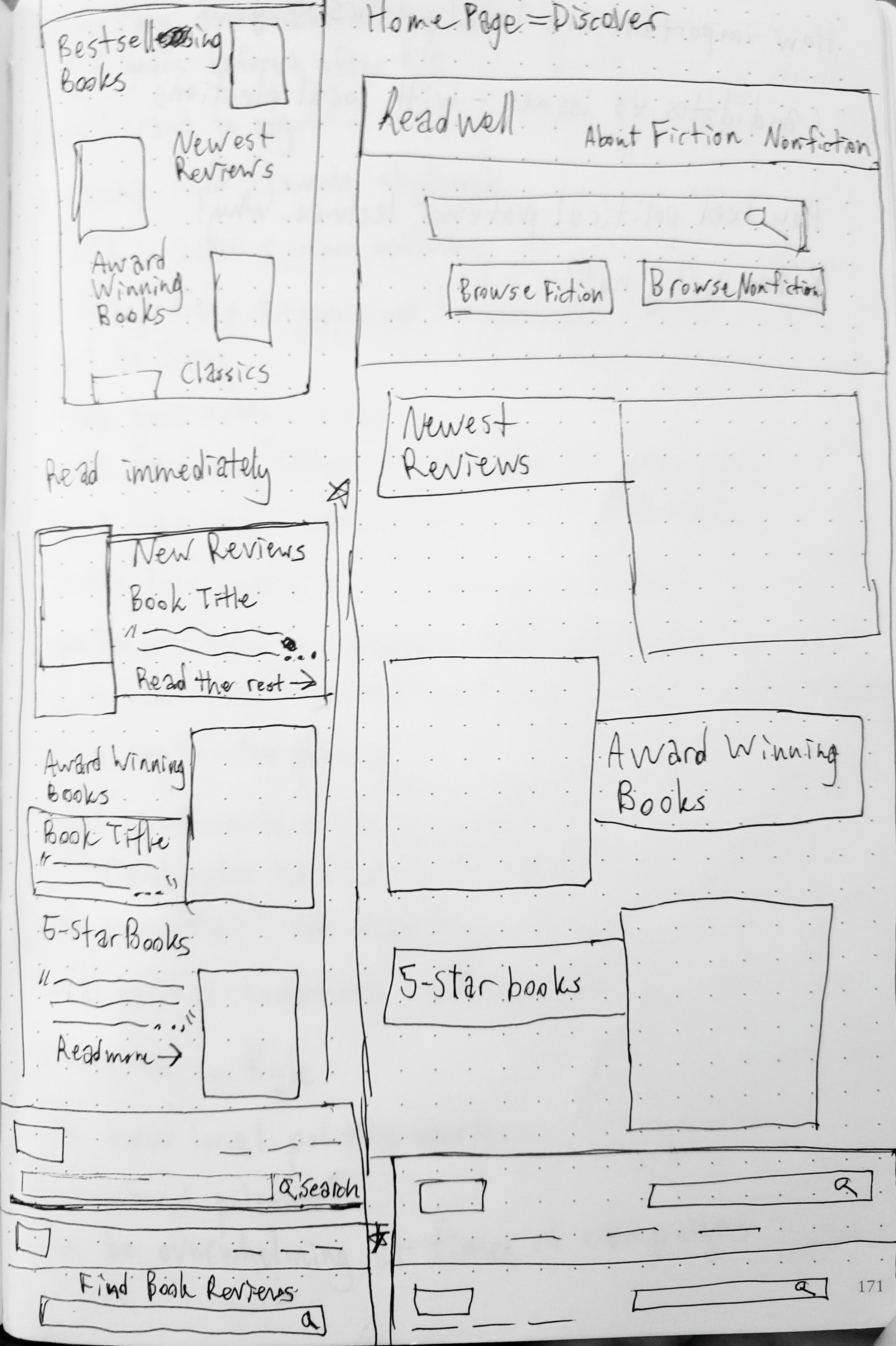
Homepage sketches

Genre page sketches
Wireframes
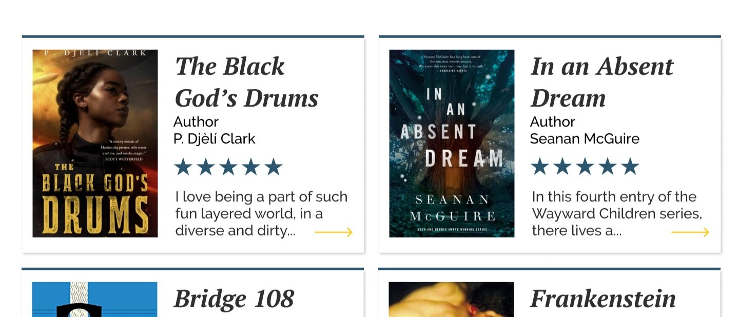
Once I knew the direction I wanted the navigation and visual design to take I created grayscale wireframes to test the layouts I had made with real content. I used the existing visual language of the site in most places but I made a few changes to improve usability. Inconsistent hover states on cards made it unclear which were and were not clickable and where. My new card design clarified linked and unlinked content and made hover states more noticeable and consistent.


High-fidelity Mockups
Once I had determined the card styling and content layouts in lower fidelity I added color and and details to create high fidelity mockups of the pages to be developed. I presented and handed off my designs to the author and the SEO manager of the site for future use.


